


Beauty Fingerprint strives on giving honest opinions on products within the beauty industry. There are no sponsorships, so one can trust that there is no opinion bias. What some people see as flaws that need to be covered up, we see them as opportunities to speak to those who have the same quirks.
See more here.
BRANDING, SOCIAL MEDIA, GRAPHIC PACKAGE
Branding
Beauty Fingerprint: the collective features that make a face perfectly imperfect. Taking that philosophy I created a mark that would be recognizable and relate to the natural beauty of the face. The slight tilt represents the quirks of every individual face.


Color Palette
The colors are meant to be fun and not feel gender-specific. Beauty is meant to be accessible to everyone and there are endless creations to be made.


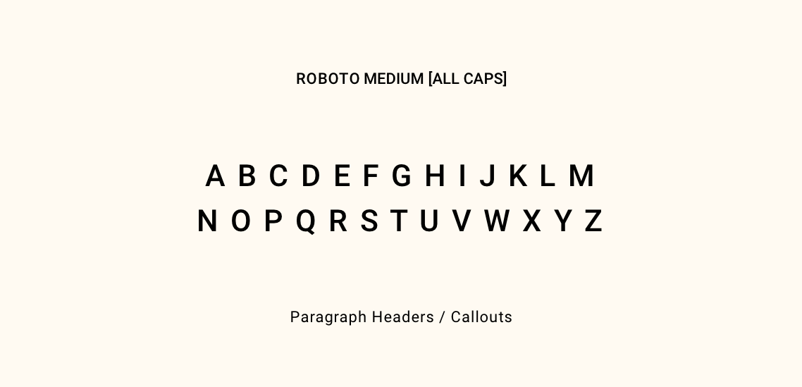
Typography
The body typography is a sans serif that reflects the logotype. Roboto is a clean and highly legible typeface that works well across different platforms and sizes.
I wanted there to be an accent typeface that would add some character to the marketing materials. Plantin MT Pro allows for a friendly feel while the italic font makes it look elegant.


Iconography
Social
As of now, the brand is specifically marketing on Instagram. Every day of the week there is some kind of audience engagement and the use of graphics or images. The stories are fun, light, and encourage a response.


